Building a Unified Design System at The Met
Problem
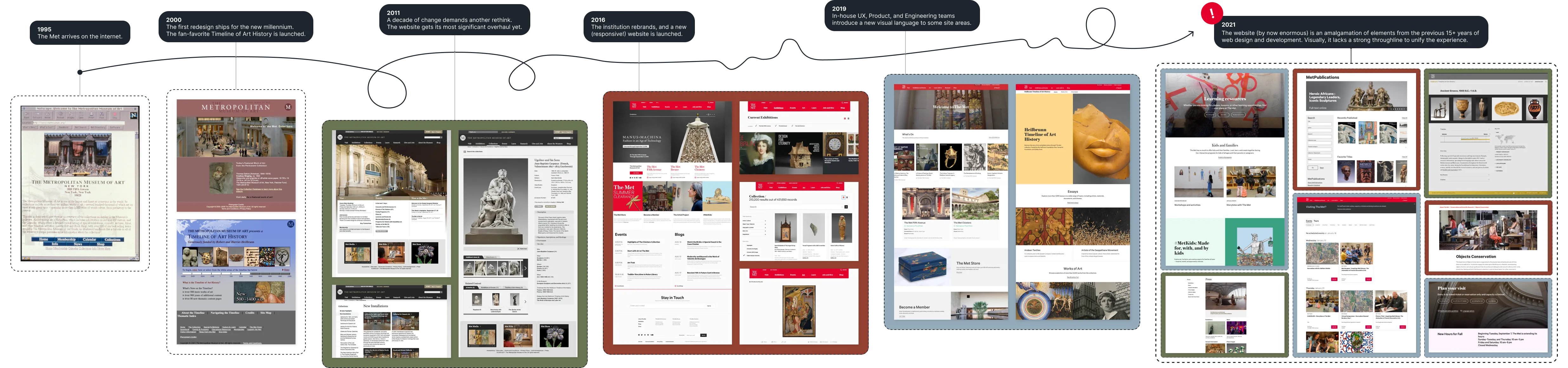
When I joined The Met in late 2021, its website felt like a museum in its own right: one showcasing at least three eras of web design and development loosely stitched together under the metmuseum.org URL.
(This setup, coincidentally, was not unlike the Met itself – a behemoth envelope encasing a collage of 21 buildings from different time periods. I’ll let you imagine the difficulty of finding the right conference room.)
Each of the “eras” represented on the site had its own components, layouts, and rules. This fragmentation hurt users, hurt developers, hurt designers, and hurt PMs.
For users, it created a disjointed and disorienting experience as they navigated the website and encountered different patterns for the same interactions across pages. We were asking them to constantly relearn the interface. For engineers, working across tech stacks was laborious and inefficient. Designers and PMs felt perpetually choked by the arbitrary siloes, spending more time working around constraints than on creating best-in-class experiences befitting an industry-leading institution of the Met’s stature.

Opportunity
Having owned a component library in my previous role, I couldn’t help trying to wrangle The Met’s tentacular mess into a more structured system, and this side project became my personal white whale.
In early 2023, our team began an enormous website replatforming project, moving to a new tech stack, new cloud-based infrastructure, and a new CMS. This replatforming project created a rare moment of opportunity: at last, I had a real opening to turn a side quest into the main event and consolidate the various active systems into a single, unified one.
Approach
Step one was to figure out which components we actually needed. I audited the components in use, taking a merciless razor to the set. We are a small, resource-strapped Product & Development team – probably more what you’d expect as a nascent startup than a large, 150-year old institution, but alas!
Given our size, we needed a component set appropriately sized for our resources. I kept what was working, refined what was almost working, and removed the rest from our working catalog entirely.
Some snapshot highlights: I reduced the number of buttons, cards, banners, alerts, inputs, and more in use. I standardized inconsistencies like different stroke weights and colors used across input components and introduced tokenization. Responsive behavior was chaotic across components, with reflow happening at different breakpoints. I eliminated the tablet breakpoint entirely (device data made this an easy call), consolidating all components to reflow at a single point.

As I worked through the audit, I layered in findings from usability studies — research that clarified which components were serving users well versus which were causing friction or confusion.
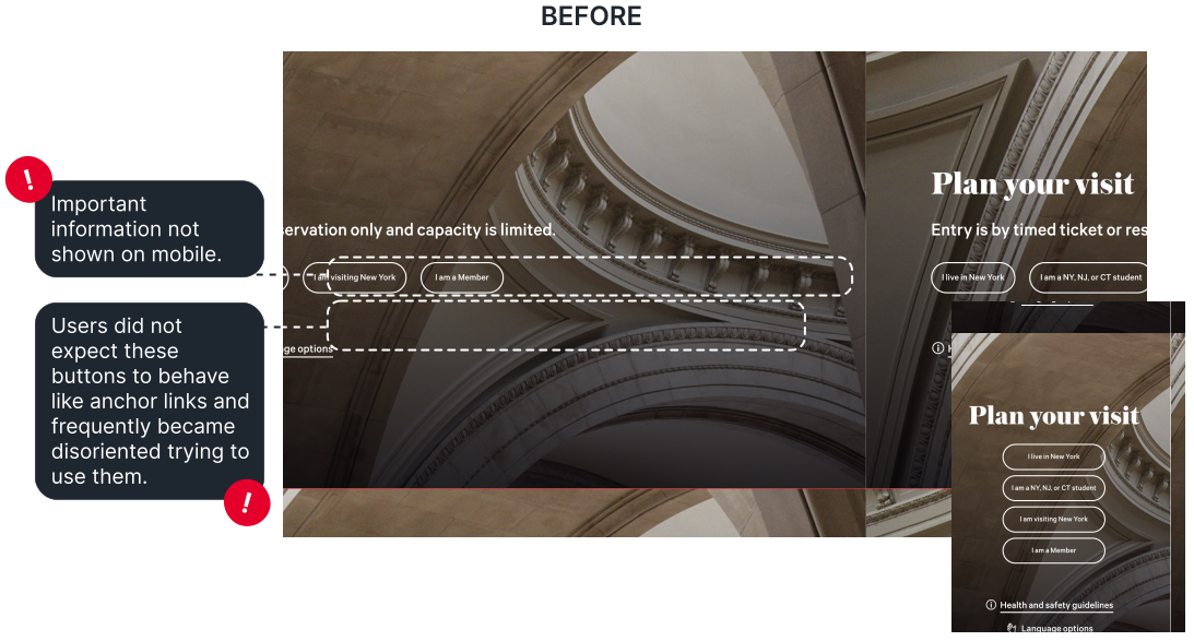
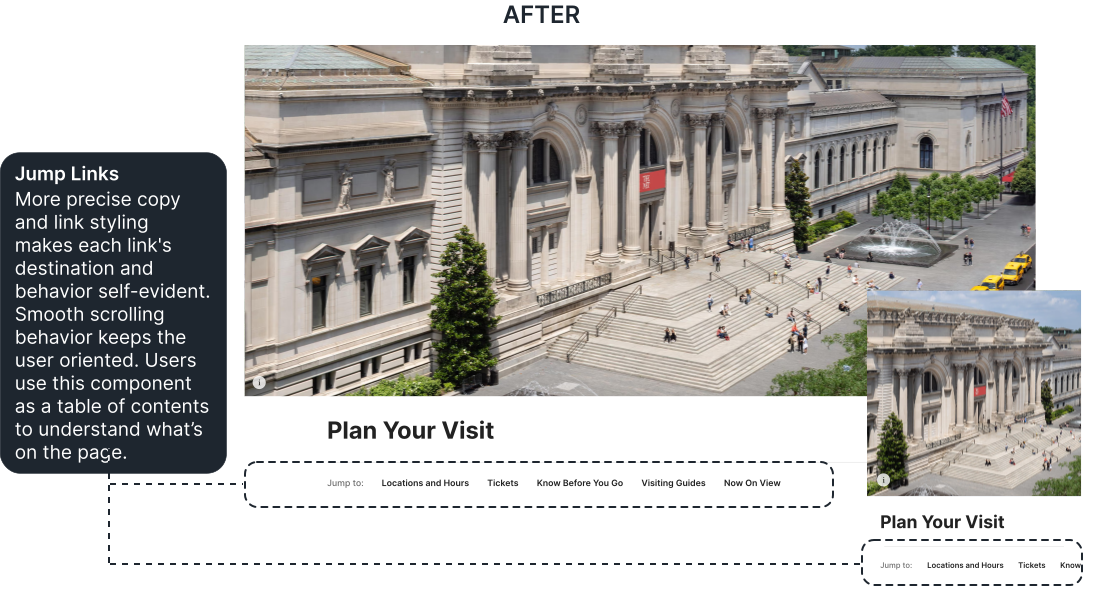
With the page header below, users consistently struggled to understand what the buttons were and where they led. They looked like buttons, but functioned as jumplinks – and because those jumplinks snapped the page instantly with no scroll animation, the whole experience felt disorienting and jarring. When remaking the header for the new system, I rethought it more holistically: updating the jumplink display, adjusting the image aspect ratio, moving text out of the header image, and building out a set of flexible variants (e.g. with or without a search bar, navigation links, or subtitle) to make sure the header could be adapted to a wide variety of page contexts.
Making it Real
What brought this project from Figma file to reality was a standing weekly working session with the team’s lead front-end developer.
These sessions were about weighing trade-offs and making decisions together in real time, while building the system. We had the trust of the team and the authority to decide and ship, which mattered enormously in helping us move quickly enough to keep pace with the replatforming.
Now, I am innately a pixel-perfectionist – I notice when an alignment is one degree off and have opinions about stroke weights at 1px vs 1.5px.
Over the course of this project, I honed my sense of when to lean into my drive for precision, and when it was better for the overall project to loosen the reins and embrace compromise instead.
I carry this ability to make thoughtful judgment calls about where implementation effort will have the greatest impact through to all projects I work on today. After all, a design that never leaves Figma has exactly zero impact on anyone, no matter how thoroughly tested or visually polished that design might be.
(We still meet weekly, though the conversations have evolved now that the system is more mature. Instead of building foundational components from scratch, we focus more on governance, evaluating new component requests, and refining states as the system continues to mature.)
Operationalizing the System
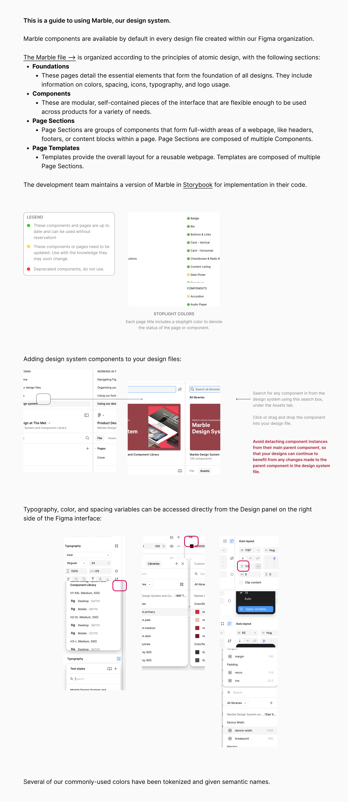
For the new system to actually stick, it needed to be easy to access, navigate, understand, and implement by the broader team.
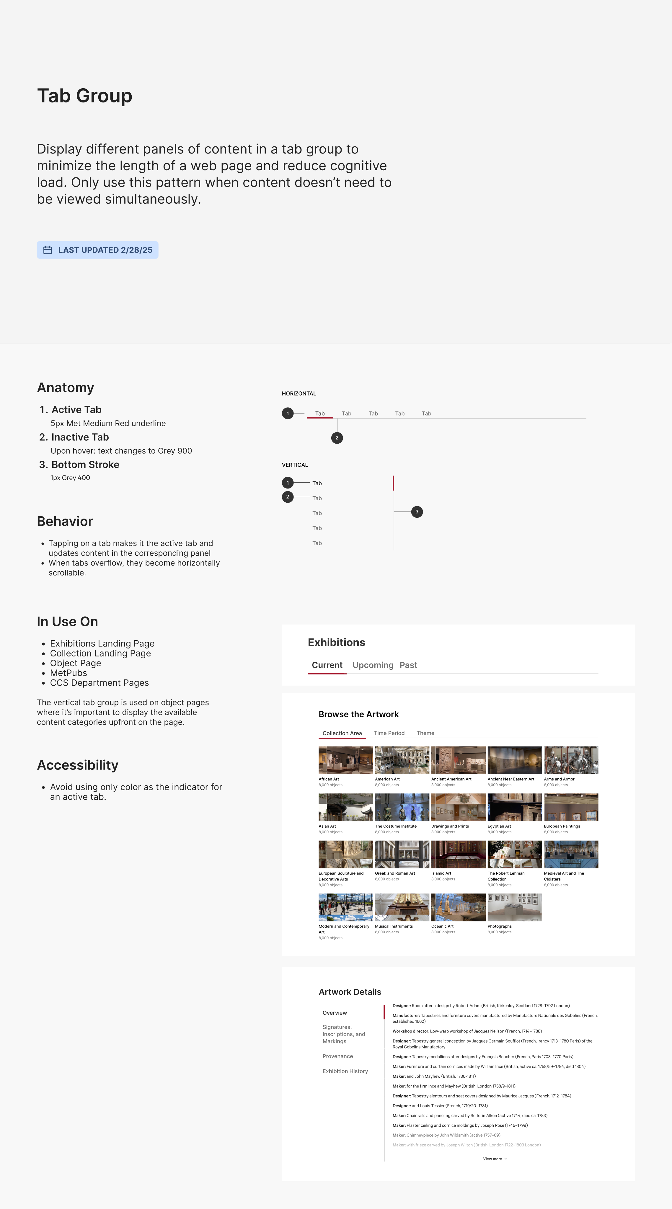
I adapted Brad Frost’s atomic design framework to reflect how our developers were building pages in practice. Each component received a consistent documentation structure that included its purpose, update history, anatomy, behavior, applied examples, and accessibility guidance (the latter thanks to the work of our 2025 Product Design Fellow, Nimisha Malreddy). When relevant, I also include notes on user research findings that informed the component's design.
I also added documentation around using the system to my "Product Design at The Met" guidelines, which helped with the socialization and adoption of the system within our Produt and Product Design teams.
Governance Challenges
It became clear that building the system itself was only half the work. Sustaining it required shared understanding, governance, and ongoing education across both design and engineering teams. I initially assumed the new design system was being reinforced within engineering workflows in the same way I was socializing it within the product team through onboarding and day-to-day guidance around how to use it. In practice, adoption was less consistent than it appeared on the surface. I realized this by asking, “Let’s update that download button everywhere,” and hearing: “Well… we’d have to do that in eight different places.”
Developers were sometimes using the system, but were also recreating components from scratch just as they had before. The governance structures I had assumed would emerge through the code review processes had not been established. This realization was 1) absolutely gutting, and 2) an important turning point in the project.
“Design systems are culture change disguised as a UI kit.” - Lauren Loprete
Never has this quote rang more true. I had underestimated just how much structural change was required to get the team to adopt the new system.
Into the Codebase
I put my user research hat back on and started speaking more directly with the broader engineering team — especially developers who had previously worked primarily on the backend before transitioning into more full-stack responsibilities — to better understand how (or whether) they were using the new components.
None of what was happening stemmed from malice or negligence (it rarely does). The system had simply evolved faster than the workflows surrounding it, and without clearly established implementation guidelines or enforcement during code review, developers naturally defaulted to what was easier for them: older habits and implementation patterns.
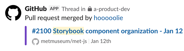
Among the issues that emerged, one in particular immediately stood out to me as a solvable problem with enormous potential to unblock adoption: Storybook, the dev’s frontend component workspace and depot. Components were inconsistently organized, difficult to locate, and disconnected from the documentation system being maintained in Figma. All of this meant that, in practice, it was often faster for developers to rebuild something than to confidently determine whether a reusable version already existed.
After aligning with the engineering team on a proposed structure, I got set up in our repository and began contributing my first PRs to reorganize Storybook.
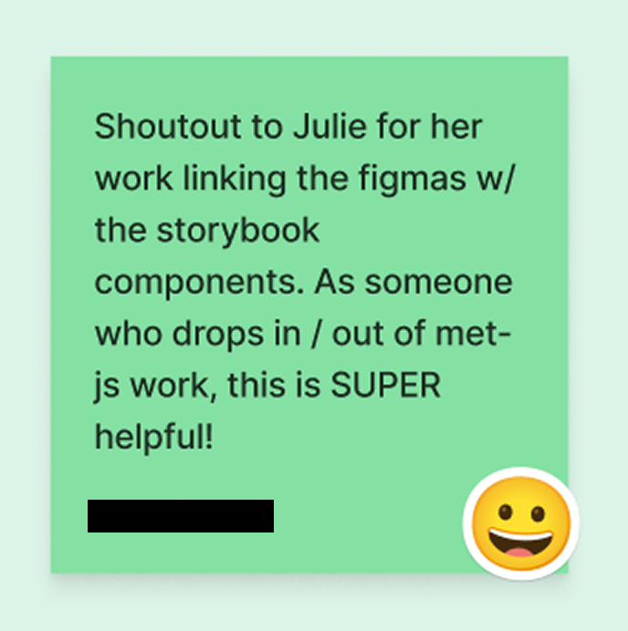
I restructured the library to more closely mirror the atomic organization established in the Figma component system and standardized naming conventions across both environments so design and engineering were speaking the same language when discussing components. I also connected Figma documentation directly to Storybook components, allowing the design system documentation to function as a shared source of truth within the tools developers were already using day to day.
Outcomes
Hiccups aside, the system has become a regular part of the day-to-day workflow across much of the Product and Engineering teams.
-
Users get the consistency and coherence they should have.
The user benefits are quieter, but no less real. The original problem was that visitors to the Met's website were constantly relearning the interface — encountering different patterns for the same interactions depending on which era of the site they'd landed on. What a unified system offers, above all, is consistency: the same components, the same behaviors, the same visual language across pages, so that the interface recedes and the content takes over. Users shouldn't notice the system. That's the point.
-
Engineers gain efficiency and speed.
The impact on engineering workflows has also been substantial. Developers who had not traditionally worked on front-end page building are now building them regularly with this kit of parts, assembling pages more quickly and consistently using shared system patterns. As adoption increased, more developers could be called on to build these FE pages, relieving some stress on former bottleneck areas. We even recently did the unheard of and finished FE dev on a set of pages (Watson) ahead of schedule on the roadmap.
-
Product team is unblocked for higher value work.
Because the system is now embedded into onboarding and everyday workflows, fellows and new hires are able to ramp up significantly faster than before. There is also a less obvious downstream effect. A team that is not perpetually rebuilding existing patterns or working around technical debt has more capacity to actually listen to users — to run research, act on findings, and improve experiences deliberately rather than reactively. The system didn’t just clean up the interface. It freed up the people building it. According to my manager, it was the first time the team had a component library and documentation system robust enough to confidently share with external vendors and internal partners alike.
