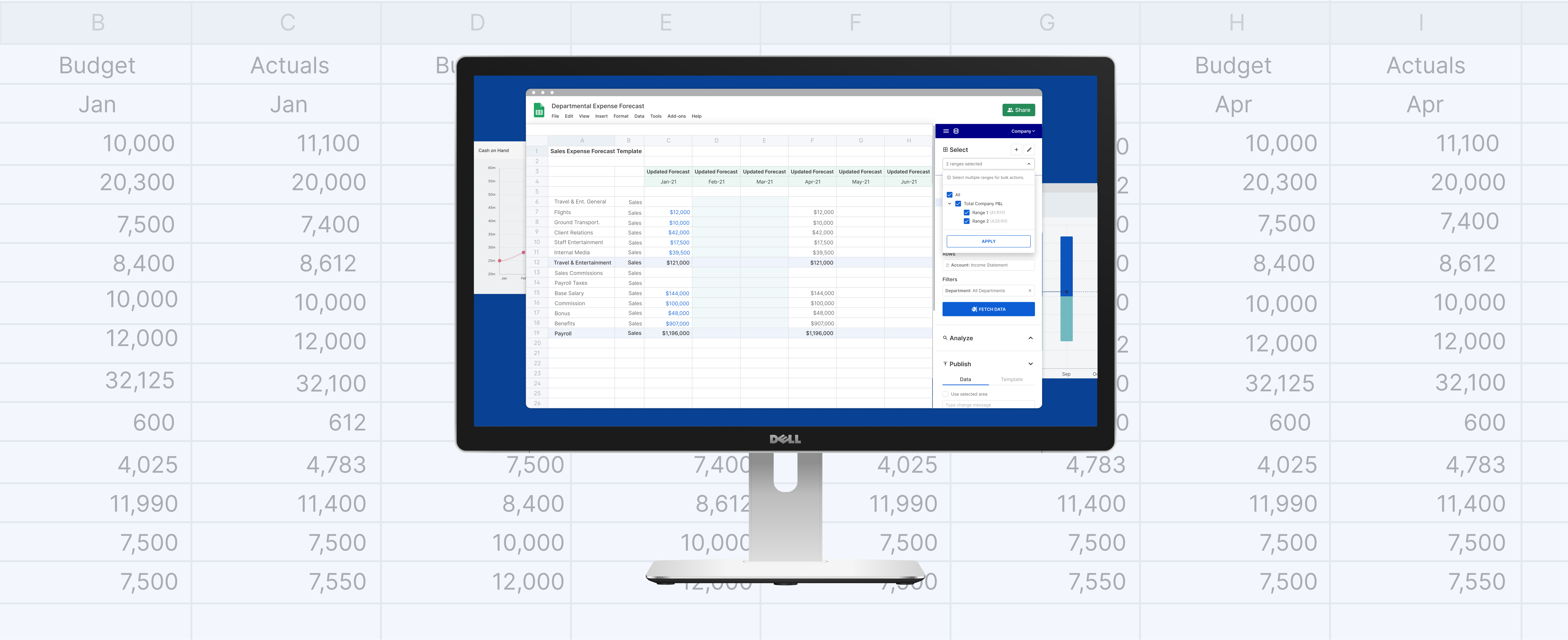
I revamped the way Cube users pull financial data into their spreadsheets. This core functionality is now more scalable and provides growing finance teams a nimbler and more efficient way to keep their workbook data fresh.
Role
Product Design
Tools
Figma
Timeline
4 weeks
Product Design
Tools
Figma
Timeline
4 weeks
About Cube
Cube is a B2B SaaS product that facilitates financial planning and analysis (FP&A) for CFOs, analysts, finance mangers, and department heads. The FP&A space is dominated by behemoth enterprise companies whose products have steep learning curves and force users to use rigid legacy tools, which often have counterintuitive workflows. Cube flips this industry standard on its head and instead aims to shape its products to match the user’s mental models and preferred workflows. In finance today, this means embracing the spreadsheet.
Cube is a B2B SaaS product that facilitates financial planning and analysis (FP&A) for CFOs, analysts, finance mangers, and department heads. The FP&A space is dominated by behemoth enterprise companies whose products have steep learning curves and force users to use rigid legacy tools, which often have counterintuitive workflows. Cube flips this industry standard on its head and instead aims to shape its products to match the user’s mental models and preferred workflows. In finance today, this means embracing the spreadsheet.

Enter the Add-on
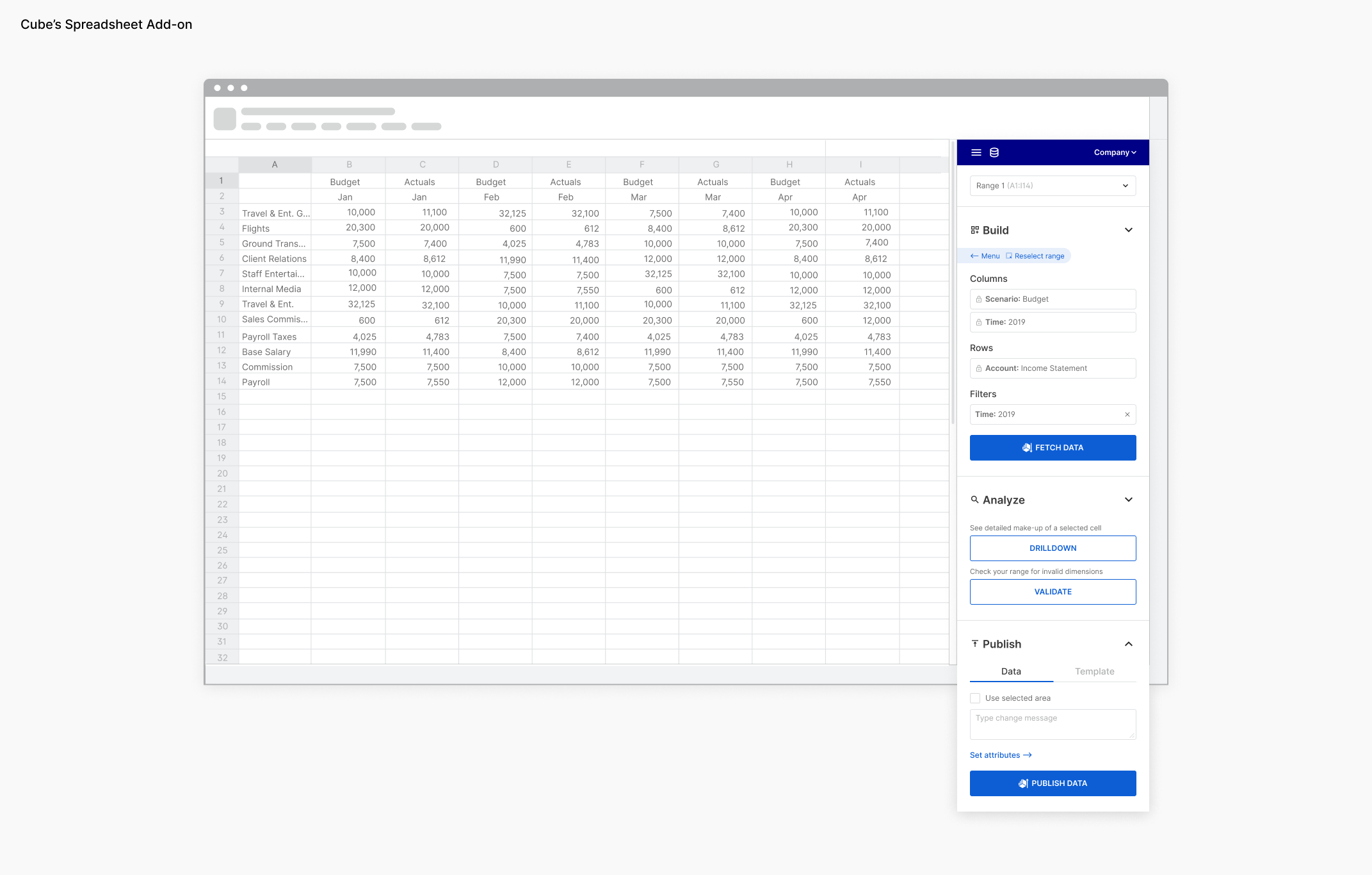
Cube’s add-on appends to Google Sheets or Microsoft Excel, and gives users access to all of the financial data they have stored in Cube’s multi-dimensional database. From the comfort of their spreadsheets, they can both pull values down as well as push values up to the database.
Cube’s add-on appends to Google Sheets or Microsoft Excel, and gives users access to all of the financial data they have stored in Cube’s multi-dimensional database. From the comfort of their spreadsheets, they can both pull values down as well as push values up to the database.
The Problem
As our users’ companies and their financial models grew, they linked an ever-increasing number of spreadsheet ranges to Cube. The add-on, however, did not keep pace with these changes, only allowing the user to fetch data to one spreadsheet range at a time. This limitation made closing the books and other regular finance processes extremely tedious – ultimately providing an experience more akin to Cube’s legacy competitors.
As our users’ companies and their financial models grew, they linked an ever-increasing number of spreadsheet ranges to Cube. The add-on, however, did not keep pace with these changes, only allowing the user to fetch data to one spreadsheet range at a time. This limitation made closing the books and other regular finance processes extremely tedious – ultimately providing an experience more akin to Cube’s legacy competitors.
Interviewing Users
Operating on a tight deadline, our company chose to further explore this problem during a design sprint. I was tasked with curating and organizing the activities for the sprint. I was delighted to have six design sprint participants to help conduct user interviews and ideate together during the first few days of the sprint. I did all of the prototyping and subsequent concept testing myself. Over the course of our user interviews, the following areas emerged as focal points the final design solution would have to address:
Operating on a tight deadline, our company chose to further explore this problem during a design sprint. I was tasked with curating and organizing the activities for the sprint. I was delighted to have six design sprint participants to help conduct user interviews and ideate together during the first few days of the sprint. I did all of the prototyping and subsequent concept testing myself. Over the course of our user interviews, the following areas emerged as focal points the final design solution would have to address:
1. Time
Lots of time was perceived wasted with the current repetitive fetch workflow. By reducing the time our users spent fetching to refresh data, we could free users to focus on more strategic, value-add activities.
2. Visibility
Visibility into system processes was of particular importance to multi-player finance teams, as opposed to individual users of Cube. With multiple people collaborating and updating the same files, it is crucial to have visibility into other peoples’ actions and their impact on company financial data.
3. Applicability
We originally made an assumption that this painpoint revolved mainly around the “Fetch” action in the sidebar. That assumption was validated; however, users also expressed desire for batch publishing and validating data via the add-on, so our final solution would have to take the future applicability or replicability of the strategy into account.

Ideation
Design sprint participants, including myself each came up with 1-2 concepts via various quick sketching exercises. Sketches were assessed and discussed among participants, and three were selected to be prototyped and tested with users.
Design sprint participants, including myself each came up with 1-2 concepts via various quick sketching exercises. Sketches were assessed and discussed among participants, and three were selected to be prototyped and tested with users.
Concept Prototype Testing
The following three prototypes were concept tested on six users:
The Job Manager
This prototype introduced the concept of a “job” – a tool that allows the user to create and run batch action sets – via a new tab in the add-on.
︎ Those familiar with macros tended to gravitate towards this concept
︎ Disjoint nature of the Jobs tab
︎ Jobs felt “distant” and “backgrounded”
︎ Complexity of learning a new tab’s-worth of functionality
The Range Manager
The “Range Manager” allowed the user to launch and monitor bulk fetches and publishes from a modal.
︎ Range manager was easy to locate
︎ Ability to save sets
︎ Ability to see fetch history
︎ Icons not familiar
︎ Confusion stemming from visibility of existing “Fetch” button
︎ Target click areas too small
The Integrated Approach
This prototype integrated bulk action support within the existing range selection dropdown.
︎ Functionality felt integrated into the existing product, familiar
︎ Simplicity: “I wouldn’t have to train anyone.”
︎ Inclusion of an Audit Trail to track updates
︎ Navigation to other sheet ranges confusing
Towards a Final Solution
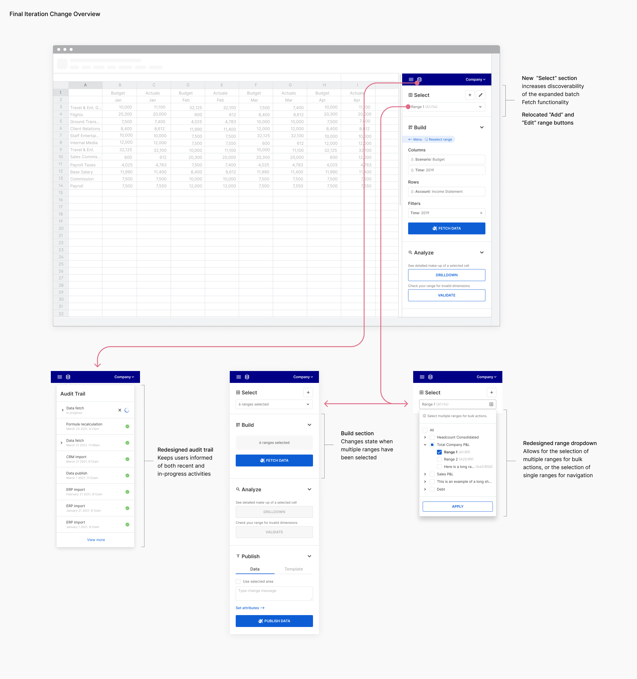
Following the completion of the design sprint, I took full command over subsequent feature iterations. I introduced a new add-on section called “Select” to house a new, simplified range dropdown and the action buttons formerly housed in the range dropdown itself. I iterated on the audit trail, aiming for more breathing space and legibility. These iterations were tested with our internal FP&A experts and customer success team.

Measuring Success
This feature is currently (as of July 2021) in developement, and slated for release by the end of the third quarter. We will be keeping an eye on the following metrics for success:
This feature is currently (as of July 2021) in developement, and slated for release by the end of the third quarter. We will be keeping an eye on the following metrics for success:
- Increased Cube usage: more ranges created per workbook, more fetches run, more scenarios created, more source data connections added to Cube
- Reduced time spent fetching to workbooks